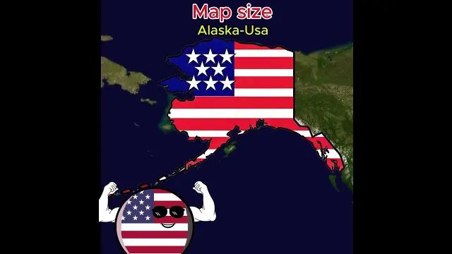
Comparing 2D world map country sizes to their actual equator proportions
A visual comparison demonstrating how countries like Saudi Arabia, Australia, Spain, and Alaska actually appear relative to their true size at the equator.
YouTube · Historyballmap · 20 September 2026 Watch on YouTube
Tried this idea? Show how yours turned out.
I made thisThe title and summary are written by Tagrazzi; the video belongs to its creator and plays from YouTube.


Comments (0)
No comments yet. Be the first to comment.
Sign in to write a comment.