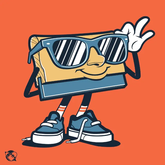
 Squeegee Print Shop Mascot Vector Design
#Logo Design
4 ideas
Squeegee Print Shop Mascot Vector Design
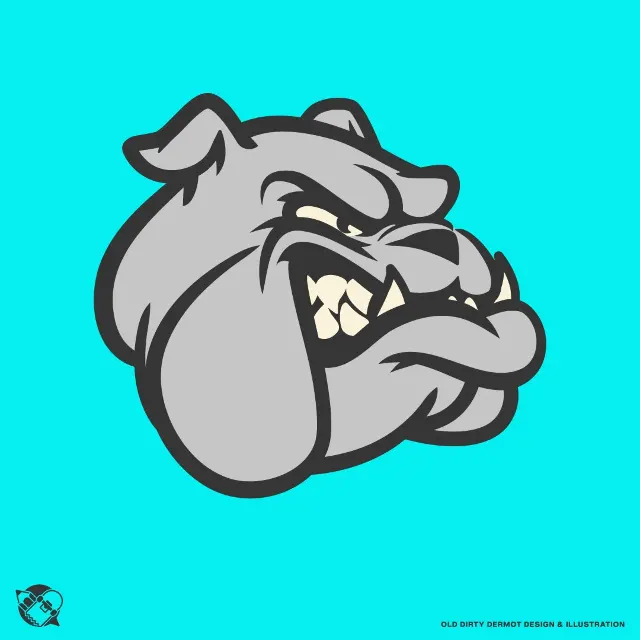 Bulldog Mascot Character Vector Design
 Comprehensive Adobe Illustrator Beginner Course for Branding
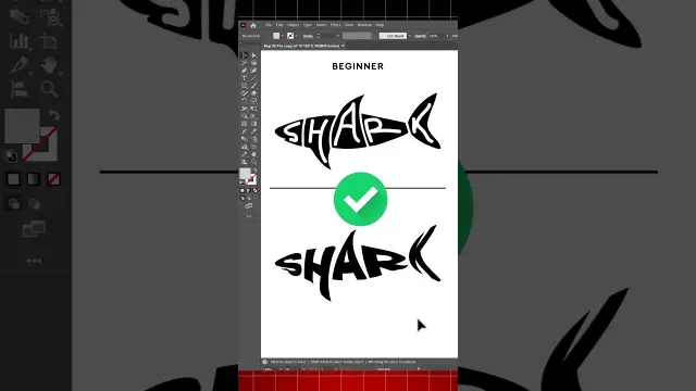 Adobe Illustrator Tutorial for Turning Shapes Into Logos
Get new #Logo Design ideas by email
Every Thursday: the week's best ideas, with the newest from #Logo Design.
Related tags
Logo Design: A Practical Guide
Logo design is the craft of creating a visual mark that identifies a person, business, organization, or product. A good logo is more than decoration: it helps people recognize something quickly and remember it later. Logos are used on packaging, websites, signs, stationery, social media, and many other places where a clear visual identity matters.
What a logo does
At its best, a logo communicates identity in a simple and memorable way. It can suggest the personality of a brand, whether that feels formal, playful, traditional, modern, handmade, or luxurious. A logo does not need to explain everything about a business. Instead, it should be distinctive, appropriate, and easy to use in many different sizes and settings.
Main types of logos
Read more
There are several common logo styles, and each serves a different purpose:
- Wordmarks use the name itself in a stylized way.
- Lettermarks use initials or abbreviations.
- Pictorial marks use an icon or symbol.
- Abstract marks use a simplified shape rather than a literal object.
- Emblems place text inside a shape, seal, or badge.
- Combination marks pair text with a symbol.
Beginners often find wordmarks and combination marks easiest to start with because they are straightforward and flexible.
Principles of strong logo design
A strong logo is usually simple, clear, and memorable. Simplicity helps people recognize it quickly and makes it easier to reproduce across different materials. A logo should also be relevant to the subject it represents, without relying too heavily on obvious clichés.
It is important that a logo works in black and white before adding color. If the shape is strong without color, it is more likely to stay effective in many situations. Good logos are also balanced, legible, and scalable, which means they still look good when very small or very large.
How the process usually works
Logo design often begins with research and sketching. You think about the audience, the mood you want to express, and the values the logo should suggest. Then you explore ideas on paper or digitally, trying different shapes, letterforms, and compositions before refining the strongest options.
When testing a logo, look at it in practical uses: as a tiny icon, on a light background, on a dark background, and alongside other visual elements. A logo that only looks good in one perfect setting is usually not versatile enough.
Practical tips for beginners
- Start with simple shapes and clear lettering.
- Avoid adding too many details that will disappear at small sizes.
- Check that the logo is readable at a glance.
- Make sure it feels appropriate for the subject and audience.
- Test it in one-color form before choosing final colors.
- Keep a few variations ready for different uses, such as horizontal and stacked versions.
Logo design is a mix of clarity, restraint, and creativity. When you focus on meaning, simplicity, and usability, you give your design the best chance of lasting well over time.
Videos come from YouTube and posts from Instagram; titles and summaries are our own. All rights belong to their creators.